What is the Element of Art: Color?
Color is a powerful tool in visual communication and artistic expression. It can evoke emotions, convey messages, and create a sense of harmony. Colors have three basic qualities: hue (the name of the color), value (the lightness or darkness of a color), and intensity (the brightness or dullness of a color).
Why Teach Color to Kids?
- Enhances Creativity: Exploring color encourages kids to mix, create, and express ideas visually.
- Develops Cognitive Skills: Mixing colors and discussing meaning builds problem-solving and critical thinking.
- Encourages Emotional Expression: Warm colors suggest energy and happiness, while cool colors evoke calm or sadness.
- Promotes Cultural Understanding: Colors carry different meanings in different cultures, helping children appreciate diversity.
- Enhances Visual Learning: Understanding how color works strengthens visual learning across art, science, and math.
Strategies for Teaching Colors
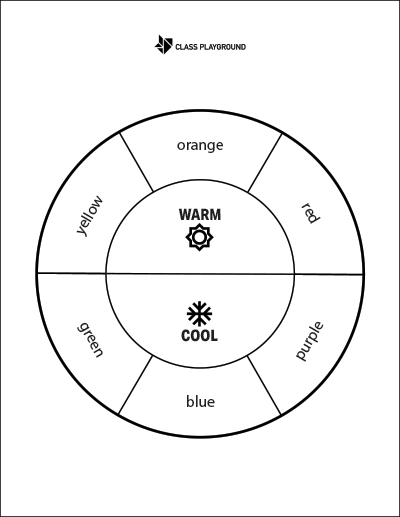
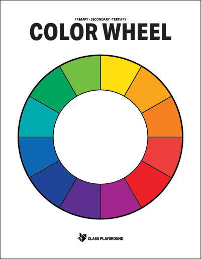
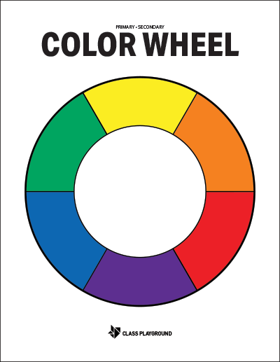
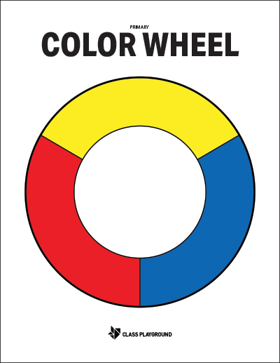
- Introduce the Color Wheel: Start with primary, then secondary, and finally tertiary colors. Reinforce concepts with hands-on mixing.
- Discuss Warm and Cool Colors: Compare how warm and cool colors affect mood and energy.
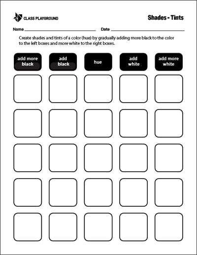
- Explain Color Value: Show how adding white makes tints and black makes shades, building depth and contrast.
- Teach Color Harmony: Demonstrate complementary, analogous, and monochromatic schemes to create pleasing designs.
- Discuss Emotional and Cultural Significance: Explore how color expresses feelings and has symbolic meaning across cultures.
Activities
- Color Wheel Painting: Provide primary paints and a blank wheel. Kids mix and fill in secondary and tertiary colors to see relationships in action.
- Warm vs. Cool Collage: Have students create one collage with warm colors and one with cool colors to explore mood and tone.
- Shades and Tints Artwork: Give a single hue plus white and black paint. Students create a picture using only tints and shades to practice value.
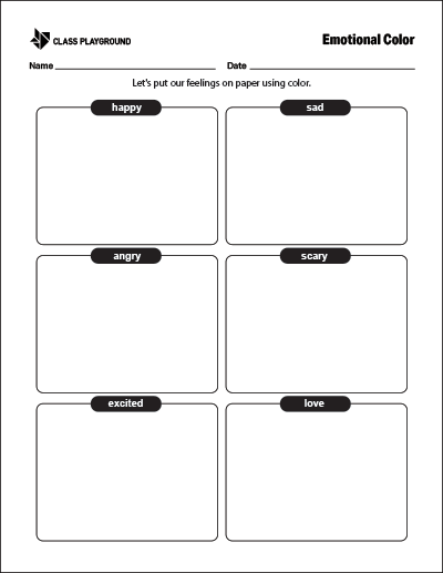
- Emotional Color Cards: Let students pair colors with emotions by designing cards that represent feelings like joy, sadness, or anger.
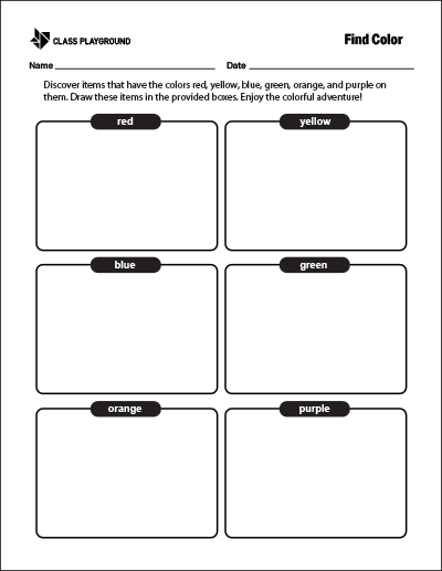
- Color Find Scavenger Hunt: Organize a search for specific colors indoors or outdoors to reinforce recognition and application.
Conclusion
Teaching color introduces students to creativity, emotion, and cultural understanding all at once. Whether through the Color Wheel, collages, or scavenger hunts, printable activities provide engaging, hands-on ways to explore how color shapes art and communication.